

If you searched for strip chart meaning, you probably landed on two very different explanations without realizing they describe two separate things. One version of the strip chart meaning comes from engineering and instrumentation — a device that records data on a moving strip of paper. The other comes from statistics — a chart that plots individual data points along a single axis. Both are correct. Both are called a “strip chart.” This guide explains the strip chart meaning in both contexts, shows you how each one works, and gives you real examples so you’re not left guessing which definition applies to you.
Why the Strip Chart Meaning Confuses People
Most articles online only explain one side of the story. Search results either focus entirely on physical chart recorders used in factories and hospitals, or they focus entirely on statistical dot plots used in data analysis. Neither approach gives you the full picture.
Understanding the complete strip chart meaning requires separating these two contexts clearly:
| Context | What “Strip Chart” Means | Who Uses It |
|---|---|---|
| Instrumentation / Monitoring | A continuous, time-based recording of measurements | Engineers, hospitals, factories, weather stations |
| Statistics / Data Science | A plot showing individual data points along one axis | Analysts, researchers, data scientists |
Once you know which context you’re dealing with, the rest becomes much easier to follow.
Strip Chart Meaning in Instrumentation and Monitoring
The Original Definition
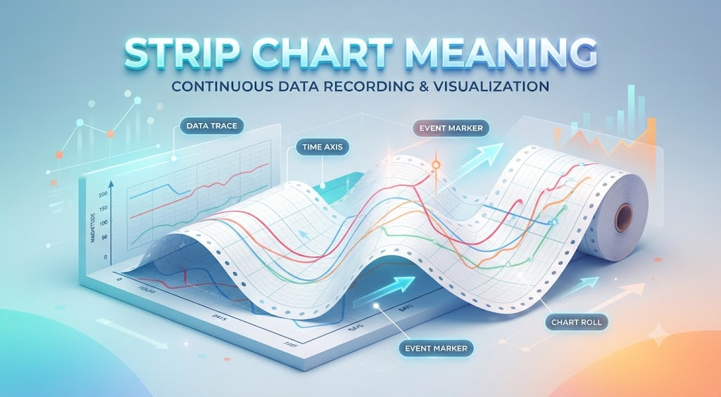
The instrumentation version of the strip chart meaning traces back to mechanical recording devices. A pen connected to a sensor would draw a continuous line on a moving roll of paper — the “strip.” As the paper advanced at a constant speed, the pen recorded whatever it was measuring: temperature, pressure, voltage, heartbeat, or any other value that changes over time.
Key traits of this version of the strip chart:
- Time runs along the horizontal axis, left to right
- The measured value runs along the vertical axis
- New data is added continuously as it’s collected
- Older data eventually scrolls off the visible display or paper
- The chart works in real time, not after the fact
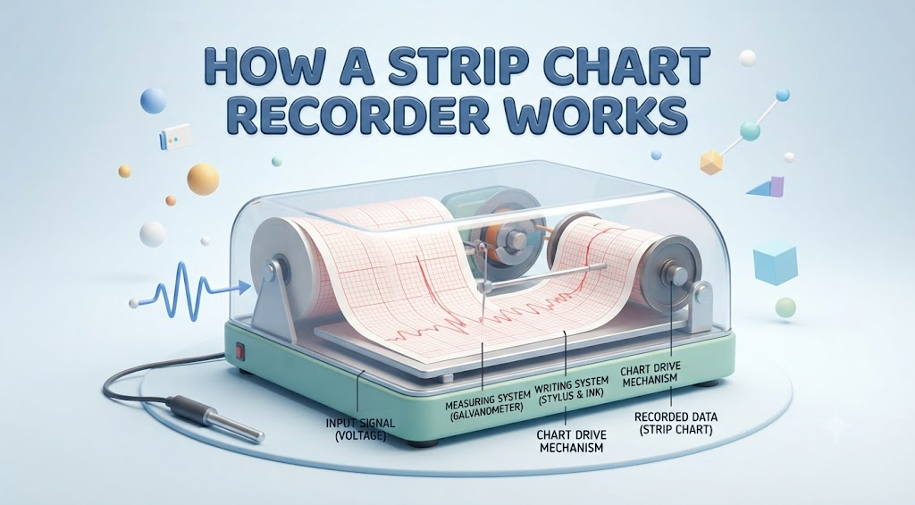
How a Strip Chart Recorder Works
- A sensor takes a reading (temperature, pressure, electrical signal, etc.)
- That reading is sent to the recording device
- The device plots the value against the current time
- The paper (or digital display) advances
- The process repeats continuously, building a timeline of the measurement
This is the version of the strip chart meaning most people encounter in hospitals, factories, and weather stations — it’s about watching something change moment to moment.
Real-World Industries That Use This Kind of Strip Chart
Healthcare
- Electrocardiograms (ECG/EKG) tracking heart rhythm
- Fetal heart rate monitors during labor
- Continuous blood pressure tracking
- Respiratory monitoring in ICUs
Manufacturing
- Furnace and equipment temperature logs
- Pressure monitoring on production lines
- Machine vibration tracking
- Process stability checks
Meteorology
- Barometric pressure recording
- Wind speed tracking over a 24-hour period
- Humidity and temperature logging at weather stations
Utilities and Energy
- Voltage fluctuation monitoring
- Power grid load tracking
- Equipment status logging
A Simple Example
Imagine a furnace being monitored in a manufacturing plant:
| Time | Temperature Recorded |
|---|---|
| 8:00 AM | 795°C |
| 8:15 AM | 802°C |
| 8:30 AM | 810°C |
| 8:45 AM | 806°C |
An operator glancing at this strip chart can instantly tell the furnace temperature is climbing and stabilizing — no need to dig through spreadsheets. Nothing riddle That’s the practical value behind this version of the strip chart meaning: fast, visual, real-time awareness.
Strip Chart Meaning in Statistics (The Strip Plot)
Where This Definition Comes From
The second version of the strip chart meaning shows up in statistics, where it’s also called a strip plot, dot plot, or jitter plot. Instead of tracking a value over time, this type of strip chart shows every individual observation in a dataset, plotted along a single numeric axis.
This isn’t about monitoring something live — it’s about examining a dataset you already have and seeing its actual shape, one point at a time.
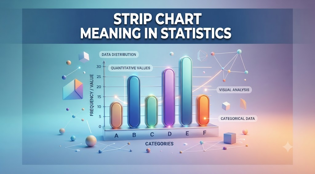
How a Statistical Strip Chart Differs
| Feature | Statistical Strip Chart | Instrumentation Strip Chart |
|---|---|---|
| Purpose | Show distribution of a dataset | Show change over time |
| Axis meaning | One numeric axis, values plotted directly | Time on one axis, measurement on the other |
| Update pattern | Static, built from existing data | Continuous, live updates |
| Common users | Statisticians, researchers, analysts | Engineers, medical staff, technicians |
Why Analysts Use a Strip Chart Instead of a Bar Chart
A histogram groups data into bins and hides individual points. A strip chart does the opposite — every single value stays visible. This matters because:
- Outliers are immediately obvious instead of hidden inside a bin
- Clusters and gaps in the data are easy to spot
- You can tell whether values are spread evenly or bunched together
- Small to medium datasets (roughly under a few hundred points) stay fully readable
Jitter: The Part Most Explanations Skip
When many data points share the same or similar value, they can overlap and stack on top of each other. To fix this, software adds a small random horizontal shift — called jitter — so overlapping points are visible as a cluster instead of a single dot.
This is important to understand correctly:
- Jitter has no meaning on its own
- Wider horizontal spread from jitter does not mean more variability
- Jitter only exists to prevent points from hiding behind one another
Misreading jitter as real variation is one of the most common mistakes people make when interpreting this version of the strip chart meaning.
Creating a Strip Chart Yourself
In R (base function):
r
stripchart(trees$Height, method = "jitter", vertical = TRUE)In Python (using seaborn):
python
import seaborn as sns
sns.stripplot(data=dataset, x="category", y="value", jitter=True)
In Excel:
- Enter your data in a single column
- Insert a scatter chart
- Set all y-values to the same fixed number (or a small random range) so points align along one axis
- Format markers to slightly overlap for a strip-chart appearance
When to Use a Strip Chart vs. Other Chart Types
| Chart Type | Best For | Avoid When |
|---|---|---|
| Strip Chart / Strip Plot | Small to medium datasets, spotting outliers | Thousands of points, too many categories |
| Box Plot | Summarizing spread with quartiles | You need to see every individual value |
| Violin Plot | Showing distribution shape at scale | Simplicity is the priority |
| Line Graph | Trends over time from summarized data | You need every raw observation |
| Control Chart | Process monitoring with statistical limits | General-purpose data exploration |
Strip Chart Meaning: Side-by-Side Summary
Since both definitions share the same name, here’s a direct comparison to lock in the correct strip chart meaning for your situation:
| Question | Instrumentation Strip Chart | Statistical Strip Chart |
|---|---|---|
| Does it update live? | Yes | No, it’s built from a fixed dataset |
| Is time one of the axes? | Always | Rarely |
| Main goal? | Monitor change | Examine distribution |
| Typical tool? | Chart recorders, DAQ software, LabVIEW | R, Python, Excel, BI tools |
| Example user? | Hospital technician, plant operator | Data analyst, researcher |
How to Read Either Type of Strip Chart
Regardless of which version applies to your situation, look for these patterns:
- Trends — a steady rise or fall over time (instrumentation) or a lean toward one end of the axis (statistical)
- Spikes or outliers — sudden jumps or isolated points far from the rest
- Clusters — multiple points or readings grouped closely together
- Flat lines or gaps — stability, inactivity, or a possible sensor/data issue
- Cycles — repeating patterns that show up at regular intervals
Advantages and Limitations
Advantages shared by both types of strip charts:
- Simple to read, even for non-technical viewers
- Every individual data point or reading stays visible
- Useful for quickly spotting problems, trends, or outliers
- Works across a wide range of industries and use cases
Limitations to keep in mind:
- Instrumentation strip charts can become cluttered with very high data volumes
- Statistical strip charts lose readability once you’re working with thousands of points
- Neither type replaces deeper statistical analysis (regression, control limits, etc.) when that level of detail is required
- Physical paper-based strip charts require storage and can degrade over time
Frequently Asked Questions
What is the simplest strip chart meaning?
A strip chart is a chart that either records measurements continuously over time or plots individual data points along a single axis, depending on the field you’re working in.
Is a strip chart the same as a line graph?
Not exactly — an instrumentation strip chart updates continuously in real time, while a standard line graph usually displays data that’s already been collected.
What is a strip plot used for in statistics?
A strip plot shows every individual observation in a dataset along one axis, making it easy to spot outliers, clusters, and gaps that summary statistics can hide.
Why do statistical strip charts use jitter?
Jitter adds a small random horizontal shift so overlapping points become visible as a cluster instead of hiding behind one another; it carries no meaning about the data itself.
Do hospitals still use strip charts?
Yes, ECG and fetal heart rate monitors are common examples of the instrumentation strip chart meaning still used in medical settings today.
Can I create a strip chart in Excel?
Yes, by plotting your data as a scatter chart with a fixed or lightly randomized y-value so all points line up along a single axis.
When should I avoid using a strip chart?
Avoid a strip chart when your dataset has thousands of points or many categories, since the individual points become too crowded to read clearly.
Final Thoughts on Strip Chart Meaning
The full strip chart meaning depends entirely on context. If you’re working with sensors, monitors, or recording equipment, you’re dealing with a continuous, time-based chart built for real-time observation. If you’re working with datasets and statistics, you’re dealing with a plot built to reveal the shape of your data, one point at a time. Knowing which version applies to your situation makes the term far easier to understand — and far more useful once you start reading or building strip charts yourself.
